Mickey Mania - Timeless Adventures of Mickey Mouse
on SEGA MegaDrive / Genesis
An amazing masterpiece back from ye olden 1994!
Jon Burton's design and programming, Andy Ingram's unique style of
artwork and Matt Furniss incredible music - absolutely magical combination.
Since I didn't see anything of the level layout extraction done anywhere on the net - here, I did it for you!
I don't realy have any time editing articles anywhere else, barely any
sometimes to do them here, so if you happen to be proficient in editing
TCRF or HiddenPalace articles, feel free to skim whatever is useful from here to put there.
Differences in beta version
Since I'm only looking at level artwork assets here, beta-to-final changes here are only related to those.
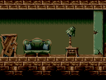 | → | 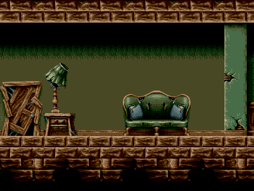 |
Level "On the Table" was initially designed shorter:
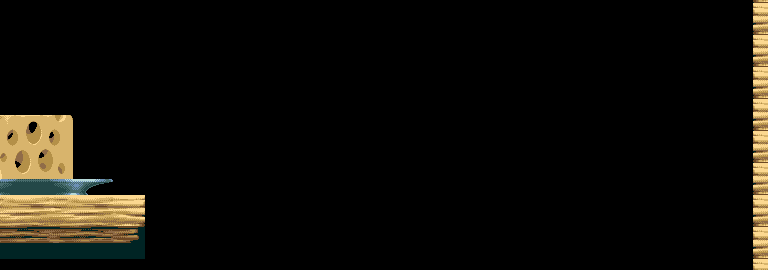 |
| "On the Table" level originally (in beta) had no ending part with the bottle. ↓ |
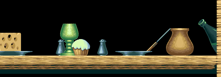 |
Since tiles are shared between level and background assets, adding that bottle later added some garbage in the background of the final version. However, since that background garbage is below the screen area, it is not normally visible. See for yourself: On the Table (final) versus On the Table (beta).
Mickey Mania 2
Sadly, instead of Mickey Mania 2 there was Toy Story.
While a technical marvel, I'm not particularly fond of source material:
primarily characters and setting, as wel as absolutely bland
cookiecutter "story". Mickey Mania 2, given the Burton's amazingly
inventive programming, Ingram's masterful art and Furniss' splendid
musical score, would have definitely been another true masterpiece of
this crew.
Currently we only have a video
with what could have been - preview of a pretty much done level artwork
assets for wild west level based on "Two Gun Mickey" cartoon from 1934.
I could only imagine, how good would it look and sound when finished,
with Matt Furniss'es rendition of the tunes and all the goodies.
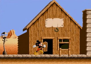 | If I'd ever get my paws on the very few necessary compressed resource files (tiles, macrotiles, level layout) for this level and day&night palettes, we'd have the amazing level artwork to enjoy here right away. |
Level artwork assets
Here's
the files - rendered out as they are in the cartridge data:
decompressed, level maps into macrotile mappings into tiles into rendered image.
PNGs are 256 color (with up to 64 used, but actually only 16
colors are used for the most part: separate 16 for level and 16 for fore/background) with the proper
palettes, but not adjusted into visually~measured exact colors as the
VDP outputs. Priority bit is not yet used here, but I'll probably
incorporate it as separate renderouts with only priority graphics
(useful for spotting what is there and also toy around making
functional mockups of the levels by layering the priority image over
the normal one) or assign palette entries 64..127 for the priority
graphics (so that visually images are the same, but retain the
possibility of treating priority graphics separately).
There are some with alternate palettes:
‣ Underground seems to have been initially designed with the Garden palette, and then made looking colder and more raw.
‣ Library light switch loads a normal palette in place of all black
entries loaded initially; respective segment of level artwork uses that
separate palette.
‣ Final Boss part clearly was designed using juicier Library palette,
and then made colder. So added here a version using the library palette.
‣ Three of the Lab levels have their transparent palette entries grey
instead of black, so I made additional versions with the entry 00 black
as well.
‣ Since Concert (Bonus) level still uses the proper level design
fileset, I included it down there as is. Actually it should be treated
as just a foreground effect.
‣ All level renders are full size, exactly as they are in cart. You can
trim those to your heart's content if you want only the used spots.
‣ And of course, all of these level layouts are free of any
sprite-objects or live animated stuff (like water or acid bubbles), so
we can see everything just the way as it is.
Enjoy!
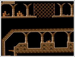 | Level design assets
|
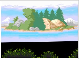 |
Level background and foreground assets
|
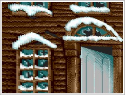 | Other related stuff
|